KC Smurthwaite is a consultant for Athletics Admin, specializing in revenue generation, licensing, marketing, and higher education. He has almost two decades of experience in collegiate athletics and the sports and entertainment industry. Smurthwaite is a fractional employee of several athletic departments across the country. He also teaches sports management and journalism as an adjunct professor. Follow him on Twitter or connect on LinkedIn. Smurthwaite can also be reached at [email protected].
You don’t often see major overhauls of Division I athletic department logos. If anything, recent trends have leaned toward bringing back retro marks with a modern twist. So when a school like USC Upstate decides to make a bold visual change—especially one that involves its Spartan imagery—it raises the question: what actually goes into a rebrand like this?
Let’s find out.
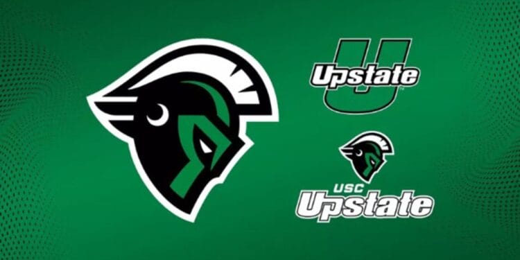
After nearly a year of research, design, and community input, the university has unveiled a refreshed athletics brand anchored by a bold new Spartan helmet spirit mark. The update includes new typography, a refined set of tertiary marks, and a fresh visual approach designed to capture the feel of USC Upstate—while preserving the equity and recognition built into the longtime “U-Upstate” primary logo.
“This new mark helps us build on our extremely successful history of USC Upstate Athletics, from NAIA National Champions to winning multiple Big South Championships this past year,” said Matt Martin, Director of Athletics and Vice Chancellor for Intercollegiate Athletics. “We’ve worked hard over the years to establish our identity, and now our brand is stronger than ever.”
The brand refresh includes a distinctive Spartan helmet design, newly introduced typography, and a modernized set of supporting graphics for all USC Upstate athletic programs. The “U-Upstate” logo—first introduced in 2011—will remain the department’s primary mark. The new Spartan helmet will serve as a secondary identity, adding depth and dimension to the university’s visual brand. The former Spartan helmet was introduced in 2004 when the school changed from USC Spartanburg to USC Upstate. Additionally, in that transition, they became the Spartans from the Rifles.
A central driver of the rebrand was the need for a Spartan symbol that stood out in a crowded collegiate landscape. The former Spartan head logo, particularly when depicted on green, was often confused with those of other universities—most notably Michigan State.
“There were a lot of similarities with Michigan State, especially when it came to the green Spartan head,” said Lenny Mathis, USC Upstate’s Senior Associate Athletic Director for External Operations. “One of our teams was at a restaurant in the Midwest, and their meal was anonymously paid for because someone thought they were a Michigan State athletic team. Whether that’s folklore or not, it shows there was confusion.”
“By itself, the Spartan head just wasn’t distinctive enough to be ours,” Mathis added.
Through focus group discussions and design iterations with Zilligen Design Studio, the university identified key themes to guide the new mark: strength, leadership, pride, and a deeper connection to South Carolina.
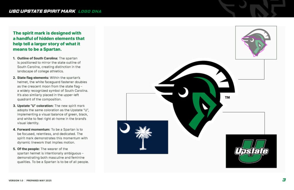
The result is a crafted emblem packed with symbolic meaning. The helmet’s profile mirrors the outline of the state of South Carolina, integrating the university’s regional identity directly into the facial structure. The white fastener on the helmet doubles as the iconic crescent moon from the South Carolina state flag, positioned in the same upper-left quadrant where Spartanburg is located on the map. The dynamic line work throughout the helmet evokes forward momentum, representing a Spartan’s relentless focus and drive.
“Overall, we wanted South Carolina to be part of the DNA of the logo, both from a state standpoint and the flag—both are represented well,” Mathis said. “We often got questions like ‘Who is Upstate?’ or ‘Where is Upstate?’ This new mark helps tell that story.”
The mark uses the same green, black, and white color palette as the existing brand for a smooth visual transition. In addition, a new typography family—Sporty Pro—will support tertiary marks and future branding elements.
The journey toward rebranding has been years in the making. “It has been talked about a lot here over the last few years,” Mathis said. “Around 2021, we started to get serious traction to make a change.”
Momentum accelerated roughly 10 months ago when the university invested in new motor coaches for shared use by athletics and other university programs. “That’s when the conversation around branding and the Spartan head took this to the next level,” Mathis said.
As the redesign process progressed, USC Upstate engaged student-athletes, coaches, donors, and administrators to provide input on the final concepts. The feedback shaped the evolution of the brand and helped ensure buy-in across campus and the broader Spartan community.
“Our chancellor was bought in and understood the thinking of it all,” Mathis said. “He and their office have been great to work with.”
The athletics department has also been mindful of the program’s place within the University of South Carolina system, gradually reintroducing the “USC” element into branding alongside “Upstate.”
“We’ve transitioned between using ‘USC’ in our logos and sometimes just ‘Upstate,'” Mathis said. “We think it’s important to be part of the University of South Carolina system, so we’ve been layering that back in over the last few years as well.”
As the new logo makes its way onto uniforms, facilities, and merchandise, the building out phase is already underway.
“Implementation is key right now,” Mathis said. “It isn’t something we’re just releasing and letting go. We’ll start to look at numbers, fonts, expanding merchandise, and retail options.”
For USC Upstate, this new Spartan mark isn’t just about a new look—it’s about declaring who they are and where they’re headed.
“We made the move to Division I in 2007 and have been carving out our brand ever since,” said Martin. “We have a lot of brand equity already. This just takes us to another level.”